The advice in this post will feel obvious. But I wouldn't be publishing it if I didn't think the content world needed to hear it.
I review hundreds of SEO articles every year, and I see the same structural mistakes again and again: "What Is X?" headers on how-to posts, "definitive guides" that barely scratch 1,500 words, and listicles where the header count doesn't match the title.
Yes, content with these structural flaws can rank, but do so despite their errors, not because of them. Too many content marketers see ranking as the finish line. It’s on page one — job done. But ranking doesn't matter if readers leave before they get what they came for. Great, you’ve got your audience’s attention. Now keep it.
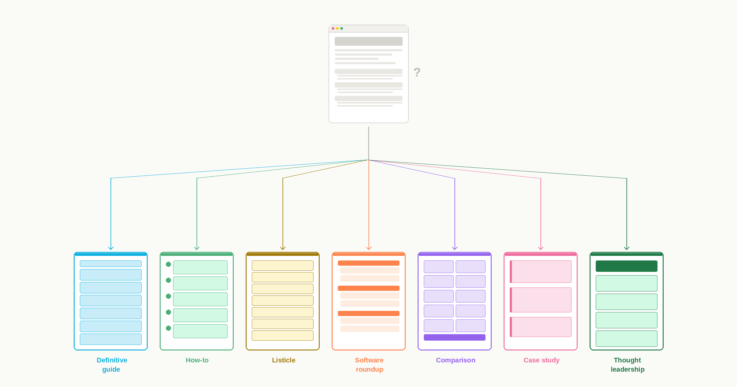
These are the seven most common archetypes for SEO (or AEO or GEO) blog content and exactly what each one should look like if you want them to be genuinely helpful for your audience. Match the format to the reader's intent, follow the structural rules, and the content will do what it's supposed to do.
Quick Reference: Match Format to Intent | |
|---|---|
Reader Intent | Best Format |
"I need to understand everything about X." | Definitive guide |
"How do I do this?" | How-to |
"What options are out there?" | Listicle |
"What should I buy/use?" | Software roundup |
“Help me decide between these two.” | X vs. Y comparison |
"Show me how this works in practice." | Case study |
"What should I think about this?" | Thought leadership |
1. Definitive Guide / Pillar Content
Comprehensive, authoritative coverage of a broad topic. The most common and egregious error is: Every piece defaults to this structure, but not everything can or should be a definitive guide. Did you hear me? Not everything can or should be a definitive guide.
If you're going to call something "definitive” or "complete" or "ultimate,” it has to actually be those things. That means exhaustive coverage, substantial length, and comprehensive treatment of all major subtopics.
A 1,500-word post with four sections isn't a definitive guide; it’s an overview. You have to be honest and clear about what you're creating. A focused how-to or conceptual piece often serves readers better than a superficial "guide" that skims everything with a hand-wave.
Not everything can or should be a definitive guide.
A definitive guide is 3,000+ words. The headers should be major subtopics that together exhaust the subject — MECE: mutually exclusive, collectively exhaustive. Each section could almost stand alone as its own article and includes internal links to deeper dives on each subtopic.
And don’t use headers that begin with -ing words. "Understanding LLMs": Do you mean "How to Understand LLMs"? Is it an argument — "You Should Understand LLMs"? Is it really a definition — "What Are LLMs"? Force yourself to commit. If you can't rewrite the header without -ing, the section probably lacks a clear point.

Use it: When you're establishing topical authority and the subject genuinely warrants exhaustive treatment.
2. How-To / Tutorial
A how-to is step-by-step instructions for completing a specific task. For the love of all that is good, please do not add a “What Is” header at the top of this article. The reader knows what the thing is. That’s why they’re trying to figure out how to use it or what to do with it.
The H2s should be the steps themselves, written as actions (e.g., "Set Up Your Chart of Accounts," "Connect Your Bank Feed") and listed in chronological order. Each step contains only what's needed to complete that step — nothing more. If a definition is truly necessary, weave it into a brief intro paragraph, not a "What Is [Topic]?" header bolted on top.

Use it: When the reader needs to accomplish something concrete and can follow a sequential process to get there. The task should be completable in a single session or have clear milestones.
3. Listicle
A listicle is a curated list of items promised in the title. The only H2s here should be the items in the list. Don’t even think of adding “Why It’s Important to Have…” as an H2. The only other H2 you might include is a conclusion.
Each item should be roughly parallel in scope and depth. You can order items by any logic — importance, category, or sequence — but you have to pick one and stick to it. Then tell the reader what that logic is in the intro so they can follow. You can further categorize by topic when appropriate, using H2s for categories and H3s for individual items.
You can add the year in the title, but don’t add it in the slug. Otherwise, you end up with a piece that says “Best Design Software of 2026” at a URL that says “best-design-software-2022.” It looks silly and confusing.
And when you refresh the piece, double-check that the number in the title matches the number of items in the list. The number of times I see a title with “13 best” for a list of nine…

Use it: When readers want to know what options exist for a particular subject. Works well for tips, mistakes, examples, and resources.
4. Software Roundup
A software roundup is a listicle, but more specialized. All the listicle rules apply (headers are the items, count matches title, parallel structure), plus the additional requirements below.
Make the headers the tool. Don’t get fancy here. And every section should follow the same structure: features, pricing, pros/cons, best for. The intro should also briefly explain your evaluation criteria. Readers need to know why these tools made the list and what you're measuring them against. Without that framing, your recommendation looks arbitrary.
Go ahead and add that comparison table near the top for readers who are scanning. And don't bury your recommendation — if one tool wins for a specific use case, say so early. That doesn’t mean “Say your tool is the best for everything.” It means you should be honest about what and how any particular software will help the customer.

Use it: When readers are actively comparing options and need help making a purchase or adoption decision. High commercial intent.
5. X vs. Y Comparison
A comparison post looks like a software roundup, but the intent is different, so the structure has to be different. A roundup answers "What's out there?" A comparison answers "Which of these two (or three) should I pick?" The reader has already narrowed the field.
That means you don't just describe each tool separately and leave the reader to figure it out. You compare them directly, dimension by dimension. The H2s should be the criteria — pricing, ease of use, integrations, support — and each section should discuss both options side by side. If you structure it like a roundup where each H2 is a product name, and the reader has to mentally cross-reference between sections, you're making more work for them.
Put a summary comparison table near the top with a clear recommendation. Readers who land on "X vs. Y" posts are often close to buying, and a lot of them just want to know who wins on one or two specific features. Tell them early, then spend the rest of the post showing your work. And be honest: If one tool is better for a specific use case and worse for another, say so. "It depends" is a valid answer as long as you specify what it depends on.

Use it: When readers have narrowed their options to two or three and need help making a final decision. Higher commercial intent than a roundup. These readers are closer to purchase.
6. Case Study / Example Breakdown
Analysis of a specific instance, company, campaign, or scenario that illustrates a broader principle.
Surprisingly challenging to get right. The reason you start writing it is to brag about your company, but you have to acknowledge that personally, then forget it and remember the reason you're actually writing it is to empathize with prospects who have the same struggle and want the same solution. They want to see your customer’s success because it's hopeful and makes them feel like they could reach the same success.
The structure generally follows a narrative arc:
Introduce the company
Describe the problem they faced
Walk through the solution they implemented
Show the outcome with real numbers
And remember, you’re not the hero. Your customer's company is the hero. You're the sidekick. They're Batman, you're Robin. Batman is stuck in a bind — Penguin knocked him out with gas — and Robin helped get him out. But Robin is still second fiddle here. If your headers read like a press release about how great your product is, you've lost the plot (and your reader).
The headers should state the actual problem, solution, and result — not be generic labels like "The Challenge" and "The Solution." You should be able to understand the narrative from the headers alone. And include real numbers and metrics where possible; otherwise, it all sounds made up and self-aggrandizing. Connect the specific example back to applicable takeaways so the reader walks away with something they can use, even if they never buy your product.

Use it: When a concrete example teaches better than abstract advice. Particularly effective for demonstrating results or building credibility.
7. Thought Leadership / POV Piece
An argument, perspective, or original point of view on an industry topic. The most difficult kind of content. More than anything, this requires a strong angle.
The headers should support and advance the central argument — each one a stepping stone in the logic. Lead with your thesis, not a buildup to it. If the reader has to wade through three paragraphs of context before they know what you actually think, you've buried the lede. Provide evidence for every claim: data, examples, logical reasoning. And acknowledge counterarguments where relevant, because if you don't, a smart reader will do it for you in the comments and you'll look like you hadn't considered the other side. The reader should finish knowing exactly where you stand and why.

Use it: When you have an opinion. The more polemic the better. The goal is to stake out a position, challenge conventional wisdom, or offer a framework others haven't articulated.
Now Don’t Let Me See Another "What Is" Header Where It Doesn’t Belong
You have the archetypes. You have the structural rules. The next time you sit down to write a blog post, figure out what your reader actually came for and give them the format that matches. Ninety-nine times out of 100, they don’t need the “What Is” definition section. Especially now. AEO and GEO have that handled.
The reader clicked because they believed you had what they needed. The structure is the first sign of whether you'll deliver.