
Many of the best-performing articles we see are data-driven. They offer a reader something they can’t get anywhere else, and that results in traffic, links, and in some cases, great press.But if writing great content requires time and effort, writing great data content requires more of both. It needs skill in analytics, writing, and design. It requires an entire team effort, pulling in engineers, analysts, and designers. You might even need to get legal sign-off. You will have Effort Shock when you see the scale of the task.If Rocky Balboa was a content marketer his montage wouldn’t include punching meat, one-handed pushups, and running up the 72 steps of the Philadelphia Museum of Art. No, some Philly Soul would accompany him writing SQL queries, wrangling multimillion-row CSV files, and working out how to rotate axis labels in D3.
The key to making it through this process is to not fixate on the second-order effects—which data points will get the most links, or PR—but to go back to basics and ask ‘how can data actually help our audience?’
The data your company has—user data, product data, collected or purchased data—is a trove of stories, insights and ideas that you can share with the world. Use your data to deliver real, meaningful help, and traffic, links and press coverage will follow.
The Strange Problem with Most Data-Driven Content
Data-driven content is content that uses one or more data points as the core for a story that is useful for your audience.Every part of that definition is important.
Data-driven content must contain some nugget of legitimate data. It isn’t important if this is a tiny statistic, or an analytical breakdown of an entire industry. Neither does it matter if its propriety, collected, or bought. Data is data.
In data-driven content, the data drives a story. It must still be great content, wrapping the data in the insight, knowledge, and understanding that you have from your experience and expertise.
That data+insight must help your audience. It can be about getting the most out of your product or helping them benchmark themselves against the rest of the industry. But the people you write for must come away from it with value.
That is a really basic definition, but is has to be made. While everyone gets point 1, and most people get point 2, it is point 3 where people get their heads turned.
Instead of writing data content for the same audience they write all their other content, they instead write it with the desired outcome of “getting links.” They neglect the opportunity to make the content useful and problem-solving for their core reader.The most egregious form of this is to write for PR and press mentions. No one is expecting to get on the New York Times website with 1,200 words on better one-on-ones. But people do expect it with data content. Great content has links, and even press mentions, as a second-order effect.But the first effect must always be to help your reader.This is what Wistia did when they wanted to share best practices for using video CTAs.
They knew customers and prospects wanted to understand how others were using CTAs, and they knew they had the data to help. So they analyzed “over 3.6 million customizations of Wistia-hosted videos — including 481,514 Calls to Action from 324,015 videos” to inform users how CTAs work best.
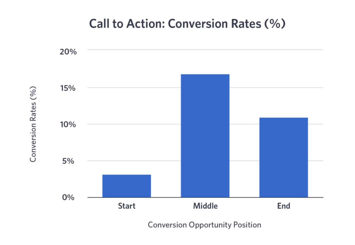
From The Wistia Guide to Calls to Action in Video MarketingThis article not only generate tens of thousands of views but also does the following:
It serves as sales collateral for the Wistia sales team. If they are on a call with a prospect, they can point them to this piece to show the conversion rates they should expect from CTAs in video.
It serves as advice for the customer success team. They can use this information to help current customers use CTAs better in their videos and help them be a success.
This didn’t make the front page of the New York Times, or even the Boston Globe, but it brought Wistia customers and helped the ones they had be more successful. That is why you write data content.Backlinks and press mentions can come naturally to these reader-centric data posts just as much as anything written journalist-first. The most-linked-to article on the AdEspresso blog, an article benchmarking Facebook Ads cost, has a staggering 4,170 backlinks from almost a thousand referring domains. This is highly sought-after information from an extremely reputable source—AdEspresso manages over $636 million in ad spend—so anyone working with Facebook Ads is going to link back to it.The same is true for getting press. This piece on the global job market that salary negotiation platform Candor produced back in May, at the start of the COVID-19 pandemic, got good press traction.
It got press by being helpful first. Candor used crowdsourced data to quickly generate a list of who was hiring, freezing hiring, or laying off employees as the pandemic took hold across the globe.The article then used this list to segment by industry, location, and sector so readers could see where the jobs still were.
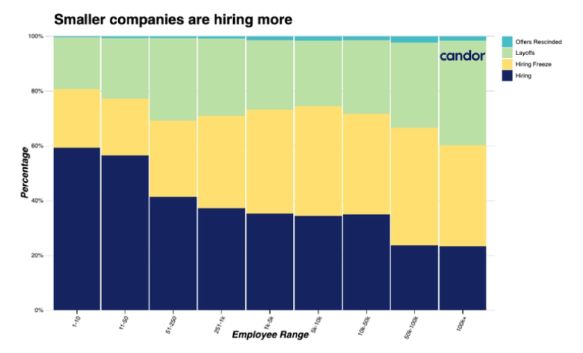
From The state of the Global Job Market in COVID-19It gave thousands of people critical information about the global job market at a time when they desperately needed it. Of course a journalist is going to write about that. The article helps readers first, and the by-product of that was more traffic and press for Candor.
Four Types of Data Content Any Company Can Write
As a more nerdy version of Wet Wet Wet might have sung, “Data is all around.”
We at Animalz have worked with well over 100 companies, and all of them have written or can write data content. It is not a matter of finding data; it is a matter of finding the right data.
Again, this is reader-centric. What is the data your readers need to know about? What is the data your readers need your insight into?
1. Proprietary Data Content
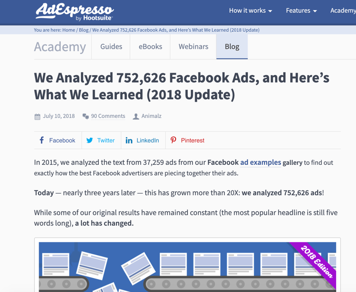
Data you own is always going to be the best data to write about. You understand it the best, it is the most useful for your audience, and it can be used in myriad ways.In their article We Analyzed 752,626 Facebook Ads, and Here’s What We Learned, AdEspresso went through their entire Ad Examples library to analyze the makeup of Facebook Ads.
The readers of this article number in the hundreds of thousands, and each of them learned how to produce best-in-class Facebook ads. This isn’t technically product data like the Wistia example above. Instead, it is a tangential dataset AdEspresso built exactly because they understood its relevance to their audience. The analysis helps that audience further.This article was initially published in 2015 and then updated in 2018. This is critical for data content—it often has a sell-by date. Whereas the truth of your 5 Tips for Remote Work is eternal, your data becomes stale quickly, and you should update as frequently as you can.But there is a plus to this extra work: extra traffic.
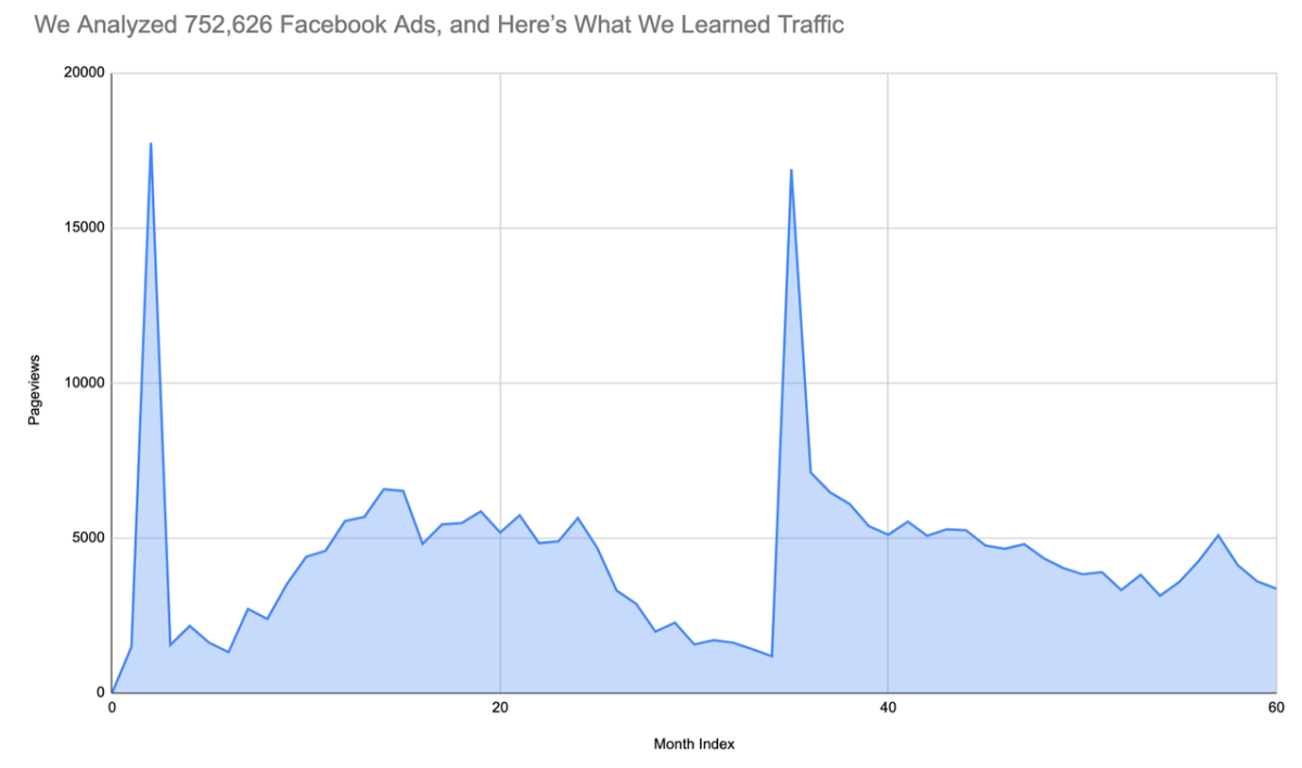
When this article was refreshed, it got a second spike in traffic from the second email burst and distribution, but it also got an increase in baseline organic traffic, which had been declining because the data had aged. It is aging again now, so this article is probably due for another update in the next year. But when it is refreshed, we’ll see that spike again, along with another rise in the baseline traffic.Not every data article needs to be a behemoth looking at all the data you have. A short article concentrating on a single piece of data can be just as helpful for your audience. This article from Wistia on optimal video length is under 800 words but gives readers all the information they need to make an informed choice on video length:
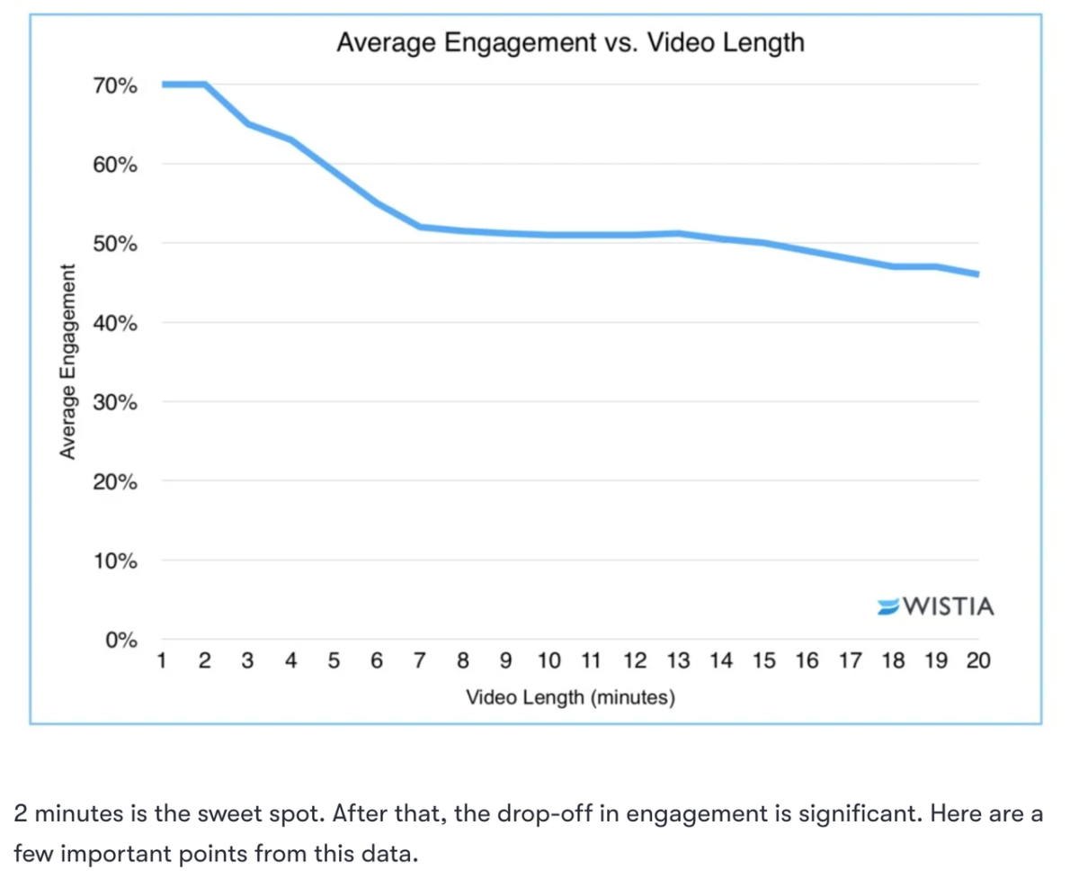
This article was written as an offshoot of the larger data analysis for the CTA guide above. If you do produce a large piece of data content, think about how you can reuse and remix the findings for other articles. You can hive-off each data point into its own smaller article and expand into detail there. People interested in just that can concentrate on that article without having to wade through the larger piece.
2. Public Data Content
Public data doesn’t give you the built-in edge that proprietary data does. In theory, anyone can find it and write about it. So you have to bring insight.This is how CB Insights approaches their data content. Sometimes they have proprietary data to work with, but they have such an acute understanding of business and tech that even when they are using outside data, they can make it feel like their own.That is what they did with How Uber Makes — And Loses — Money:
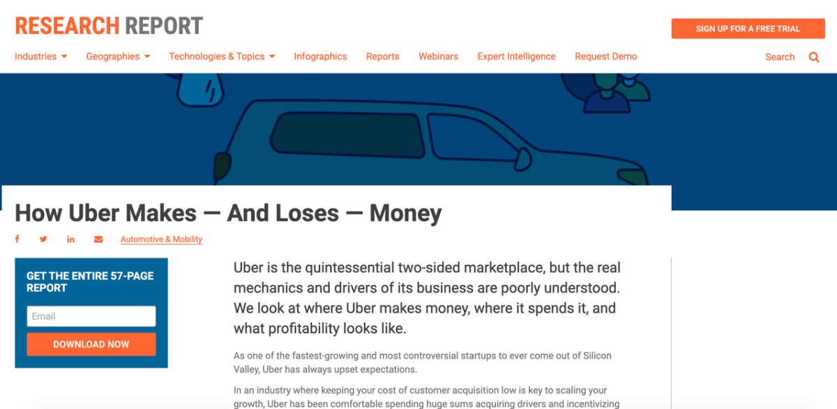
CB Insights “looked at Uber’s public financial and user data, statements from senior team members at Uber, and texts like Brad Stone’s The Upstarts formed from interviews with leaders there” in order to put together the internet’s most comprehensive report on how Uber’s financials work. Though the data is findable elsewhere, the insight and analysis are not.
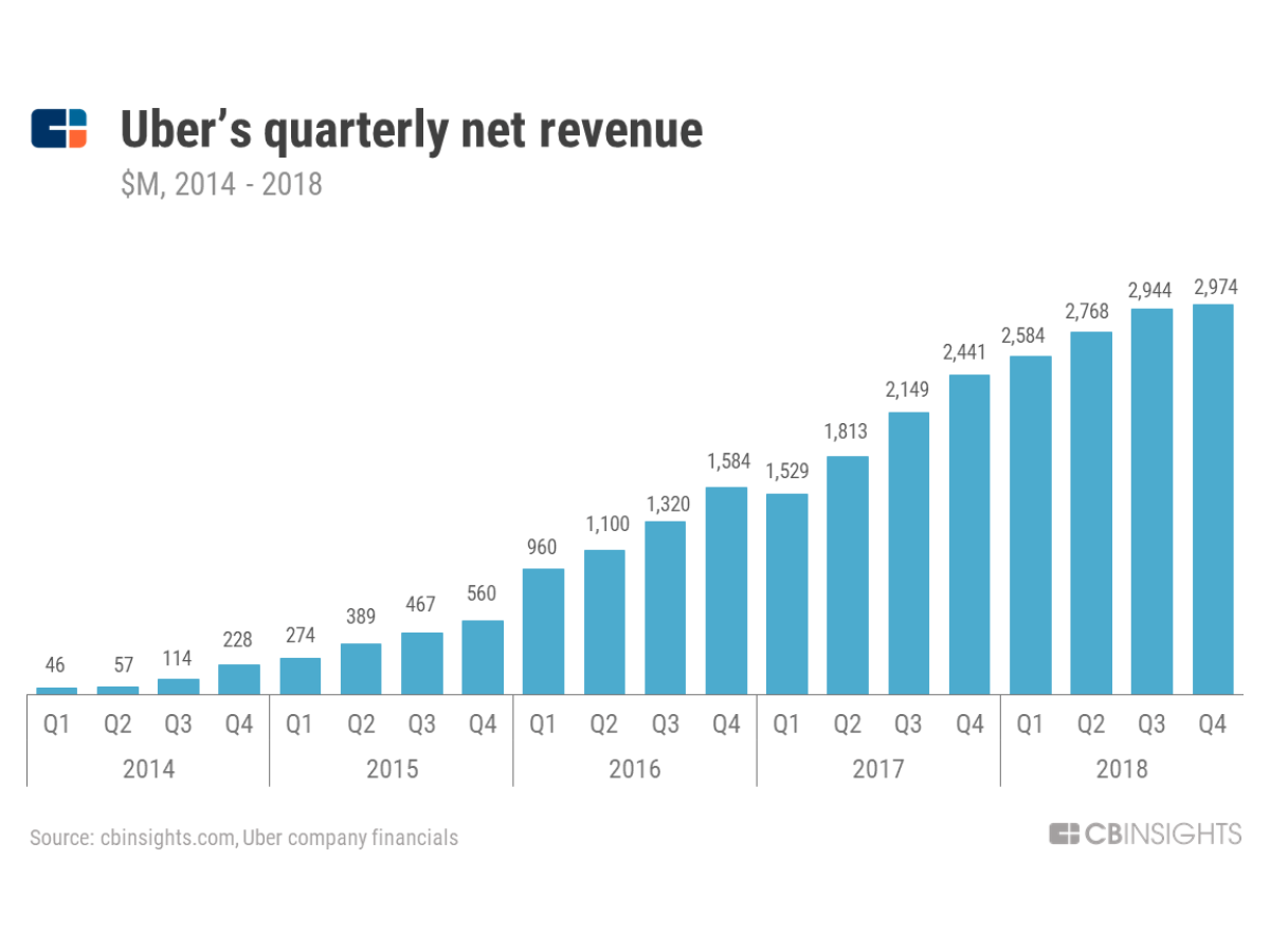
From How Uber Makes — And Loses — MoneyThat insight and analysis are what can often set great data content apart.
A common flaw with data content is that it can be too prosaic, just describing numbers but not setting them within a story that draws a reader in and explains the data in context. Data can be helpful on its own just by virtue of drawing attention to it. But it is more helpful to show a reader what a data point means to them and what they can do next with that knowledge.Clearbit’s entire product is built on data. They offer an API and products that give marketers access to data on their customers—their company, industry, and size. Clearbit wrote an article on the integrations you should be building, where they analyzed data on hundreds of thousands of tech companies to determine the most popular tech tools. Why? So that Clearbit could make authoritative recommendations to their audience.
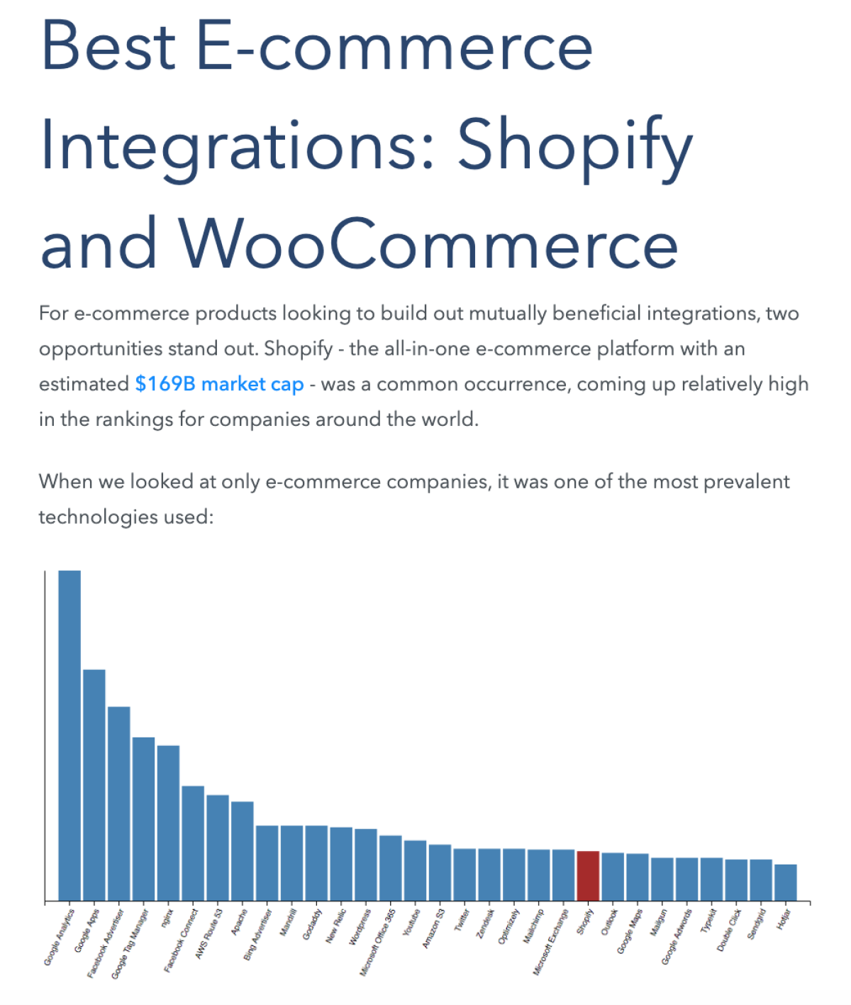
From The software integrations you should be buildingIt didn’t just say, “Hey, people use Shopify.” It said, “Hey, people use Shopify, and you can use this information to build integrations for Shopify to increase your user base.” The data is the anchor of the article, but, just as with CB Insights articles, the insight is what helps the reader.
3. Survey Data Content
If you don’t own data, and you can’t find data, then you can always ask for it.
Surveys are some of the simplest data articles to get up and running—tweet out a quick Google form link and you are collecting data. By controlling the questions, you control the data, so there is less cleaning, parsing, and analyzing. You can get the results and write it up quickly.This is how my former Animalz colleague Jimmy Daly has been running surveys for the Superpath blog.
He sends out the survey on Twitter and in the Content Marketing Slack group, waits, and then collates. He puts together a couple of quick graphics to show the results and then writes it up. Here, he was looking at salaries in content marketing and how fairly people feel they are paid, broken down by gender and ethnicity:
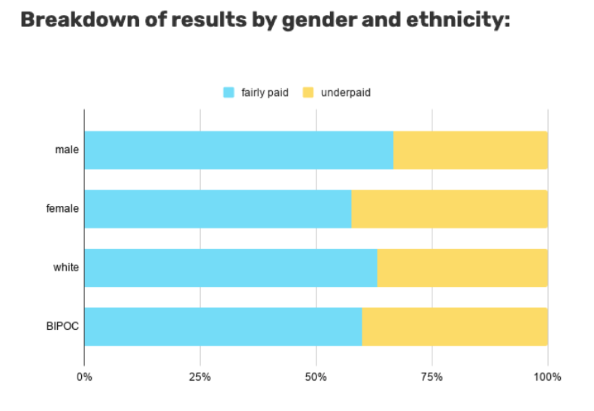
From Survey: Are you fairly paid?This way, Superpath can get data-driven content twice a month with little lift.You can also use surveys as the basis for much larger data analyses. Last year, insurance application and renewal platform Indio released their State of Renewals report. This was based on a survey of over 400 agencies, looking at “their entire renewal process — from delivering renewal submission packets to their clients to receiving signed and completed applications ready to go to market.”
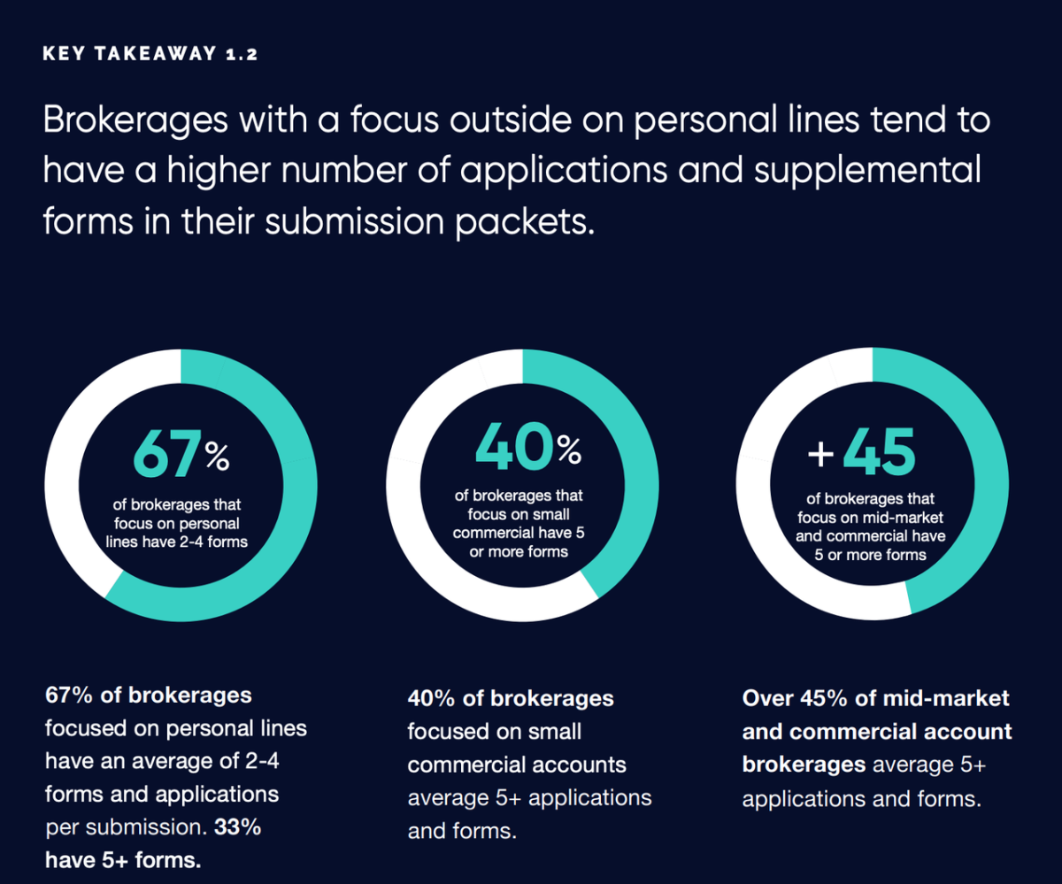
From State of Insurance RenewalsSurveys also work great for lead gen. You can create an asset with the answers as Indio did. This then becomes self-perpetuating, because you can email your next survey to the list of people who downloaded the first and ask them to respond, growing not only your email list but also your dataset at the same time.
4. Experimental Data Content
Perhaps the most fun data-driven content you can produce is an experiment. This experiment should include your product in some way to (a) show how it works and (b) show its value.This type of content is slightly more complicated to set up and analyze than other types because it is analytical. Data content can basically be broken down into two types:
Descriptive data content: This is where you use descriptive statistics to interpret data. Benchmarking is a good example of this, where you’ll use counts (752,626 Facebook Ads), averages (the mean headline length was five words), and percentages (33.04% of companies used a Learn More CTA) to allow readers to understand where they are in relation to others.
Analytical data content: This is when you specifically try to detail changes or differences between two sets of data (either a before/after or a control/experiment cohort). Here, you might also see percentages (increased conversion rates by 5.45%) or maybe even p-values if the experiment is suitably scientific.
The “increased conversion rates by 5.45%” comes from an article from Segment about how they decreased friction in their sign-up process.
In this case, they used their own product, along with Clearbit, to experiment with making their sign-up flow function better for new users. This is the kind of UX experiment almost every tech company is running on a daily basis (think of all the A/B tests you run), but Segment chose to write up their findings and use it for content. It gives readers concrete results on using Segment and Clearbit and shows how they can do this themselves.Even if you aren’t running experiments to better your product, you can still create experimental data content just for the fun of it and help you readers understand your tool and the results they can get with it. Buffer runs experiments constantly to help out their readers. In Do 3rd-Party Social Media Tools Negatively Affect Reach and Engagement? Our 200+ Post Experiment and Results they experiment with different tools for social posting, finding out whether some tools negatively effect reach.
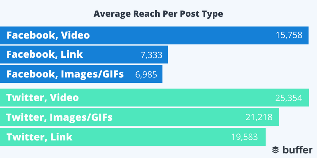
From Do 3rd-Party Social Media Tools Negatively Affect Reach and Engagement? Our 200+ Post Experiment and ResultsIf your product works, then running an experiment and showing that it works is some of the best data-driven content you can produce. If you can show your readers not just that it does work but also all the best practices to get the best results, then you’ll have created something truly valuable for them.
Getting Started With Data Content
Data content is challenging but rewarding. You’ll be adding something completely new to the world. We’ve done this a lot, with a lot of different companies. Based on all of that experience, here are a few ways to begin this exercise, along with a few pitfalls to avoid.
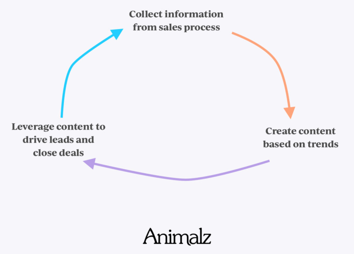
1. Start by Finding Out What Your Customers Need to Know
If you’ve got one, your sales team is a great place to find out what your customers need to know. Your team talks with customers every day, hearing objections and questions about your product. Data content is great sales collateral and can help your salespeople get ahead of these objections and questions prospects have.It is a great example of content and sales collaboration:
Or you can just ask people yourself:
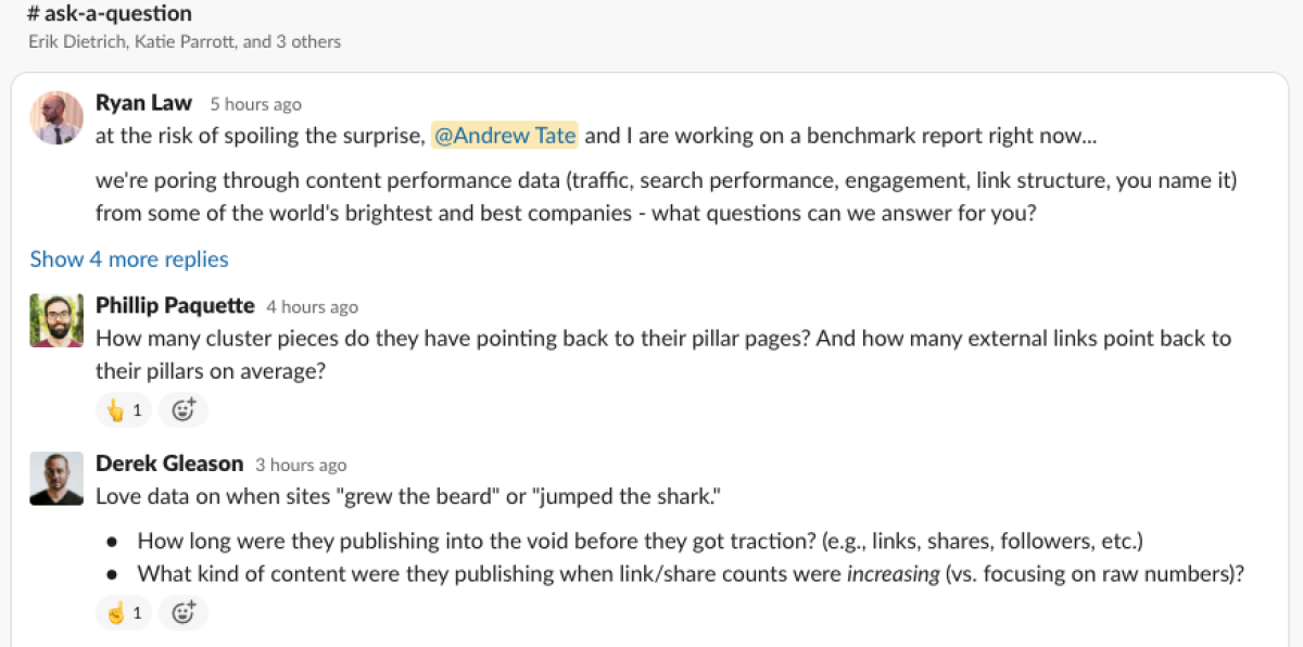
We’re working on data content right now, so Ryan just straight-up asked other content marketers in the CMCG what they’d be interested in finding out. This helps us understand where the focus on our report should be.The pitfall here is trying to be all things to all people. Yes, you can produce large reports covering multiple data points, but if you are starting out, homing in on one interesting question and addressing that in-depth will get you and your audience excited.
2. Once You’ve Got Your Questions, Find Out if Your Data Can Answer Them
You might already know what secrets your data holds, but once you have a direction for your content, you can start to get into the details. You want to have a really good understanding of the data before you start any real analysis. If you are talking proprietary data, this could mean knowing exactly what you have in your database. If you are collecting data, what and where can you get it?The pitfall at this stage is simply not spending enough time here. If you’re even a little bit of a data nerd, you’ll want to get going on the analysis. But time spent here will speed up the rest of the process.
3. Keep Your Analysis Quick and Light
When you are new to any type of analysis, this is the part that is foreboding. But most questions can be answered with very simple analysis. You don’t need to be a data engineer. You aren’t going to be running any machine learning. You should be thinking in terms of counts, sums, ratios, and percentages.Let’s take Phillip Paquette’s questions above: How many cluster pieces do they have pointing to their pillar pages? And how many external links point back to their pillars on average?This is just counts and averaging. Yet, it answers a fundamental question our audience has.The pitfall here is getting bogged down. Trying to do too much or not having a specific goal for the analysis. That is why the two steps mentioned above are so important. You need questions to guide you and to have a good understanding of the data before you start, so you can quickly get the answers. Take more time prior to this to take less time here.
4. Images and Graphs Make All the Difference
Charts and graphs are the centerpieces of data content. You just can’t describe numbers in words. Be open to spending some time here—there are some great tools that are easy to use and make graphs more appealing. At Animalz, we use a mix of straight Google Sheets charts, Figma, D3, and plot.ly.Even if you are just using Excel or Google Sheets graphs, make sure they have a title and the axes are labeled. Making it very clear to your audience what each chart is showing makes the article more compelling and the individual image more shareable.A pitfall is failing to refine design. If you have designers on your team, then definitely get them involved. If it’s just you, then iterate on your images with each article to get better at the design element.
5. Write It Up
The most important part here is to not forget the story. This should still be a good read, not just a recitation of numbers. It should explain the data thoroughly and center it within the questions the customers have. Fit the narrative to the data, not the other way around.The pitfall here is that other way around. Don’t start with a story and find the data to back it up—the data drives the story. If you start with a story and look for data to back it up, that is just regular content. Be willing to let the data lead, even if it is somewhere unexpected.
The Best Work Takes Effort
It will always be quicker to crank out “5 Best X” list or another piece of copycat content than to take time to analyze data and write up data-driven content.But this stuff is the most helpful content for your readers. You can tell them where they stand with benchmarks, you can show them the data they need to succeed, and you can convince them how to be successful with your product. Put readers first with data-driven content and you’ll end up with great content that helps them succeed. In return, you’ll get traffic, backlinks… and maybe even a link from the BBC.